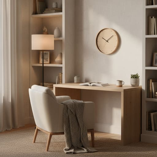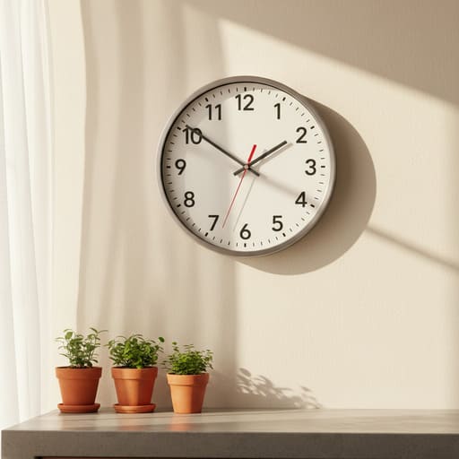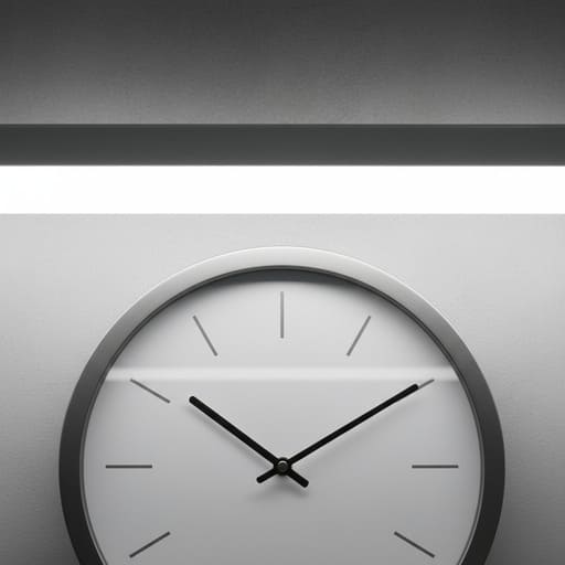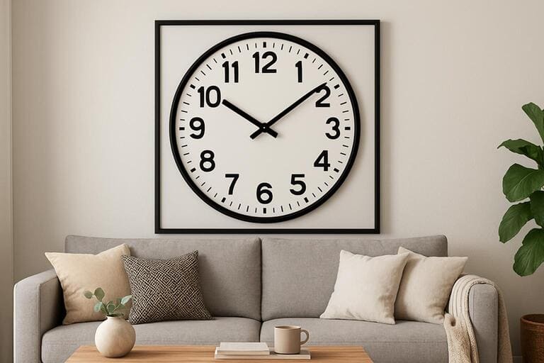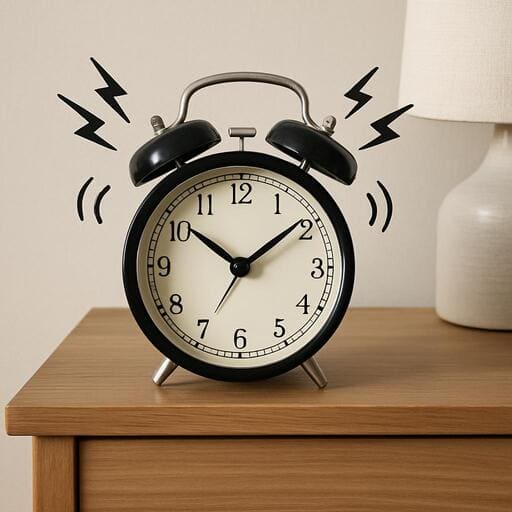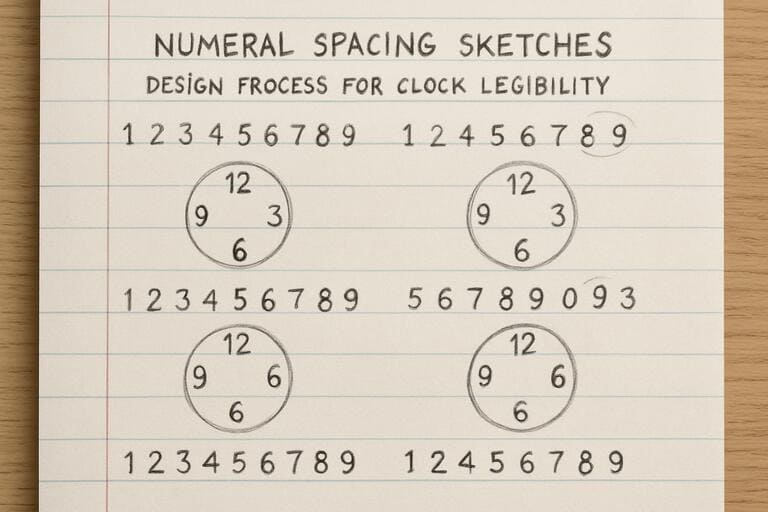


Why spacing beats size on a dial
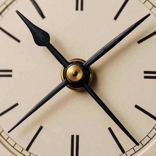
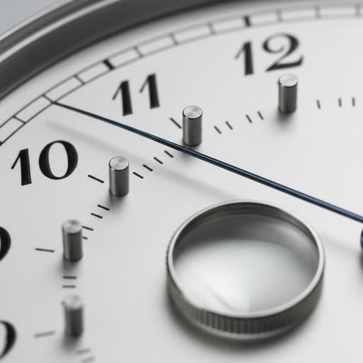
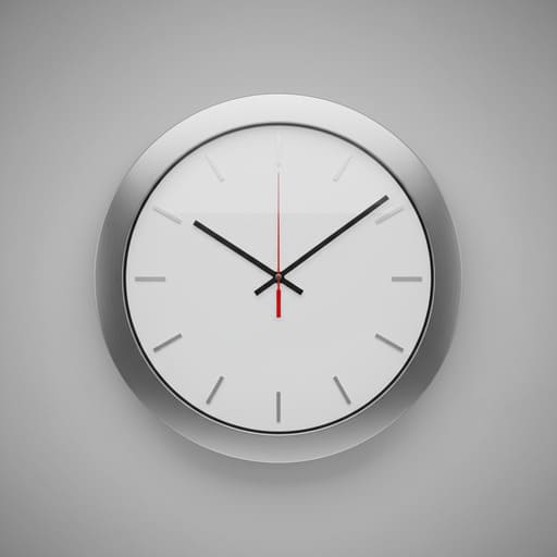
Clarity comes from rhythm: open counters, even gaps, balanced hands, and a minute track that guides a glance in half a second.
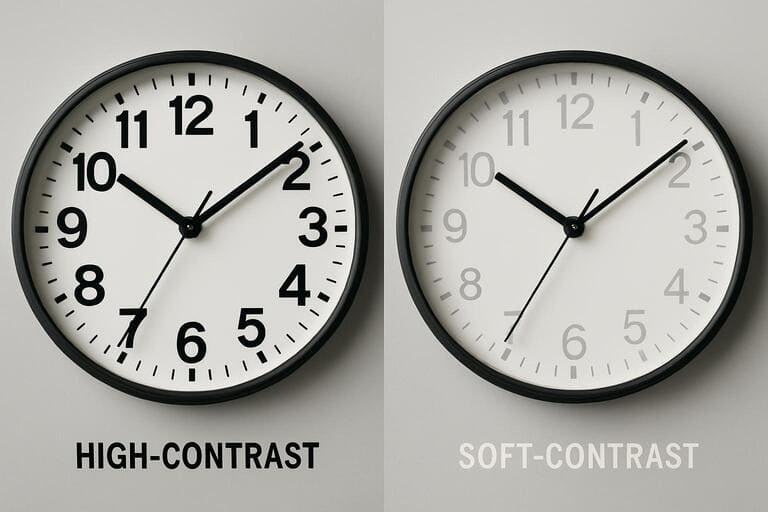
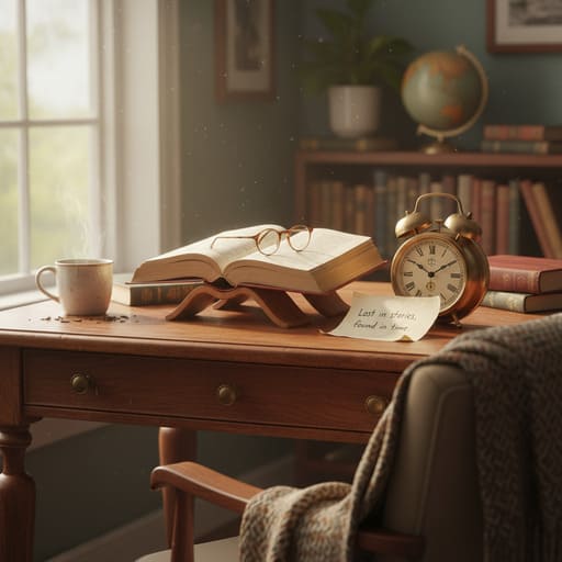
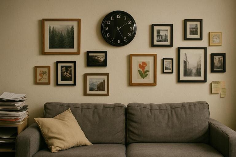
In kitchens and study corners people read time in motion — while walking past, stirring a pot, or reaching for a book. The eye samples the dial and locks onto high-contrast anchors if the spacing is generous.
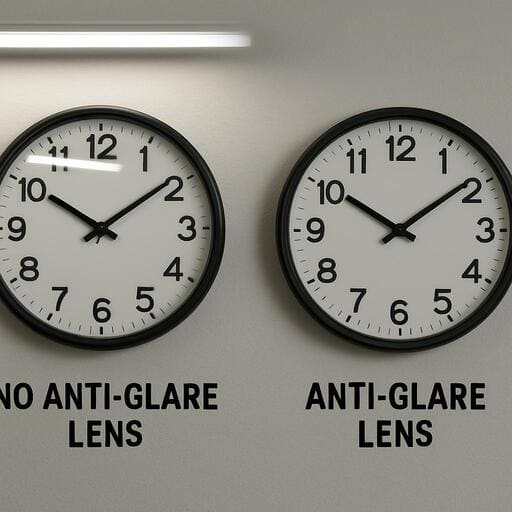
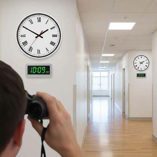
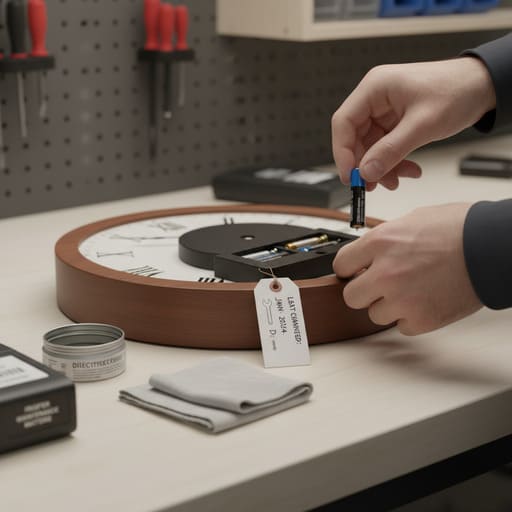
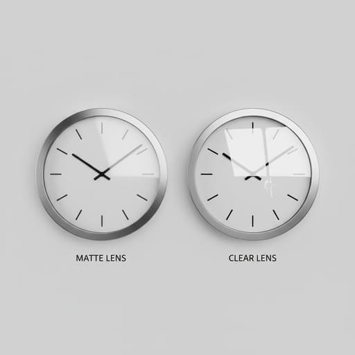
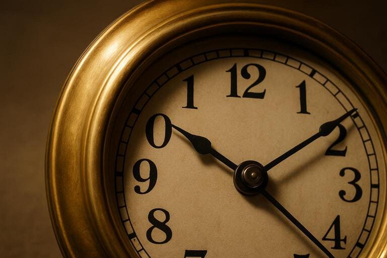
We tune our dials for distance: softer contrasts for bedrooms, crisp tracks for bright halls, and matte lenses that calm glare from tube lights.
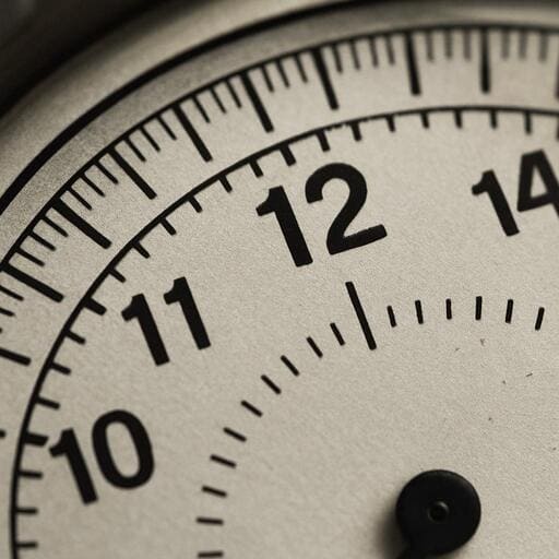
- Open counters for legible numerals
- Balanced hands reduce wobble
- Matte / anti-glare lens options